
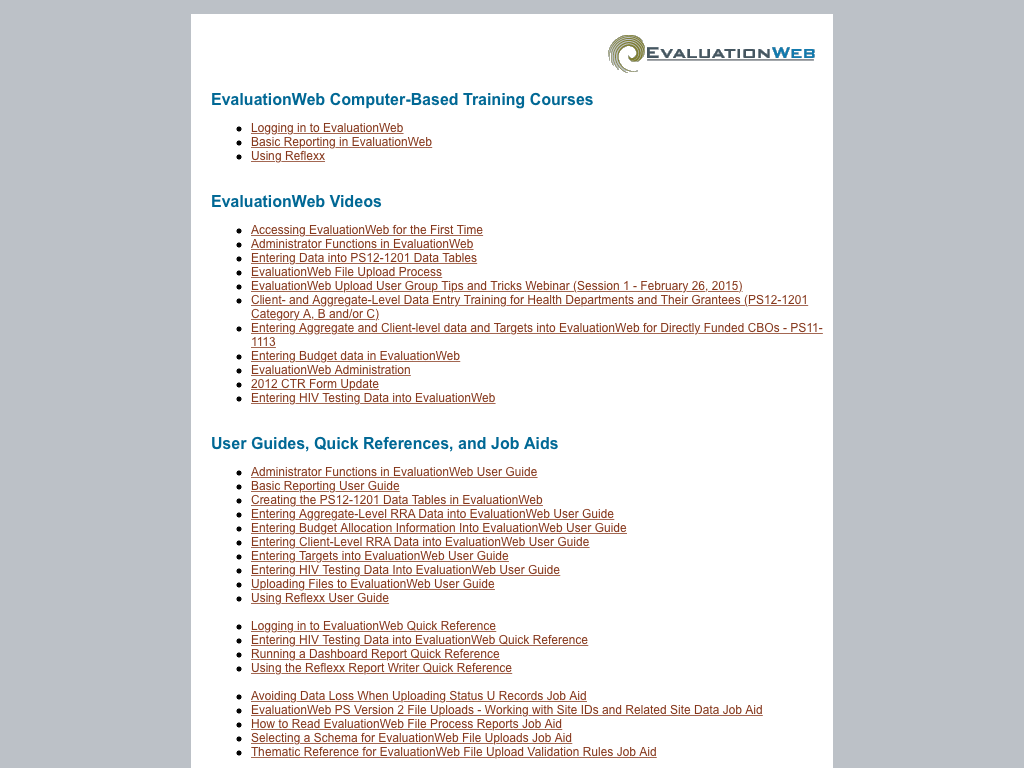
After a conversation with a co-worker expressing frustration with the company's help resources, I mounted a redesign. User-facing help resources were split between two different HTML pages. Each had begun when the number of resources (and staff to support them) was much smaller. Thus, there wasn't consideration of information architecture or layout because there were only a few links and files for each. As the number of resources grew, they had more difficulty accommodating them. Finally, the types of content expanded from a couple of user guides to quick references, computer-based trainings, videos, and data entry templates, documents.
The goals of the redesign were to:
- Clarify organization and information architecture
- Provide more information about each resource
- Provide information about how to seek help from technical support
- Present a cohesive experience across the resources
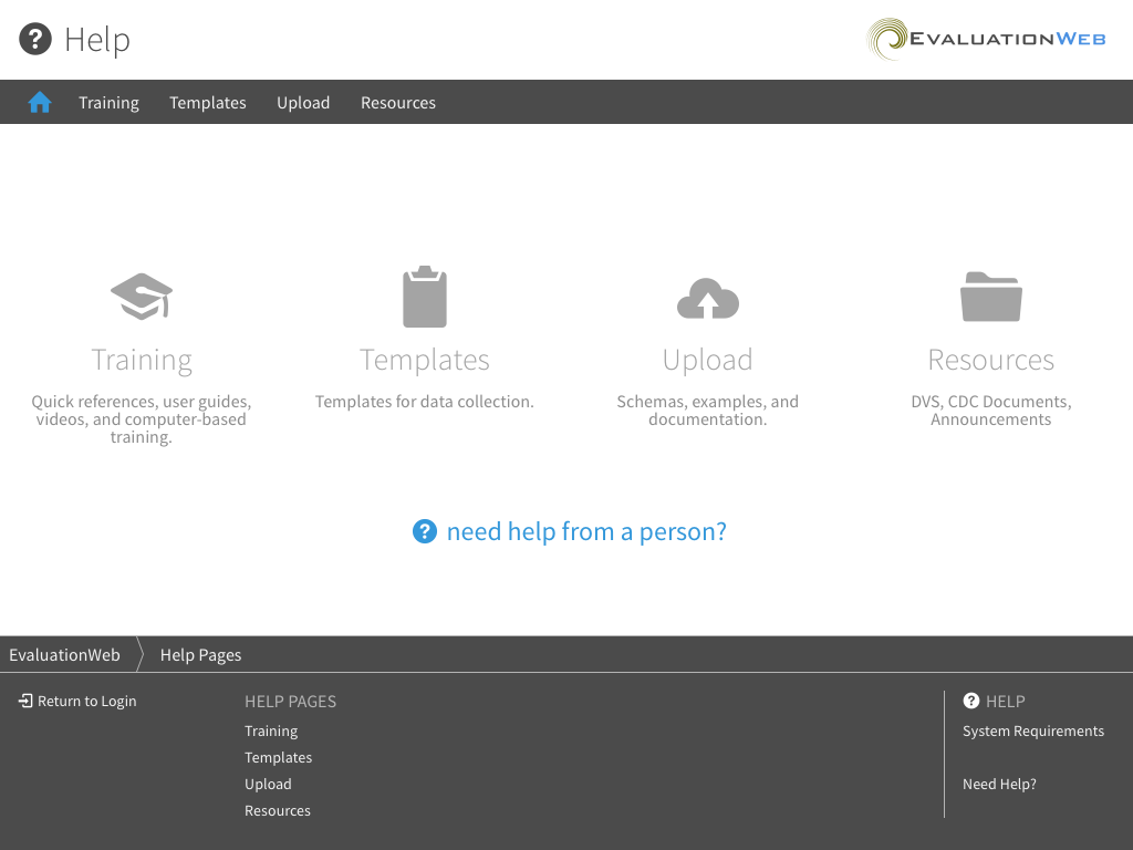 New Help Landing
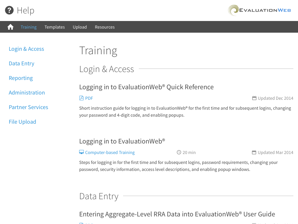 Training Resources After
To address the first goal, I worked with internal stakeholders to identify the main categories of content and how to best organize the content within them. We arrived at Training, Templates, Upload, Resources (the grab bag). The landing page provides a jumping-off place for each and a description of the category. The navigation makes it very easy to jump from category to category.
Within the page, we had the decision to organize by content category or type of resource (e.g., user guide, video, etc.). Despite previously organizing by type, organizing by content fits more with how users will engage with the content. The user doesn't think "I want to watch a video today", but rather "How do I enter my budget information?". If the help resources offer a quick reference and a video, the user can then choose how much information they want/need because they are both presented together. I organized the resources by brevity: quick references first, then user guides, then videos, and finally computer-based trainings.
To fulfill goal 2, I worked with the training team to add blurbs about each resource, so users can have some more information beyond the title as to what they will find. Additionally, I added the type of resource and time to complete (for videos and computer-based training). Finally, I added the updated date so the user can know how recent the resource is.
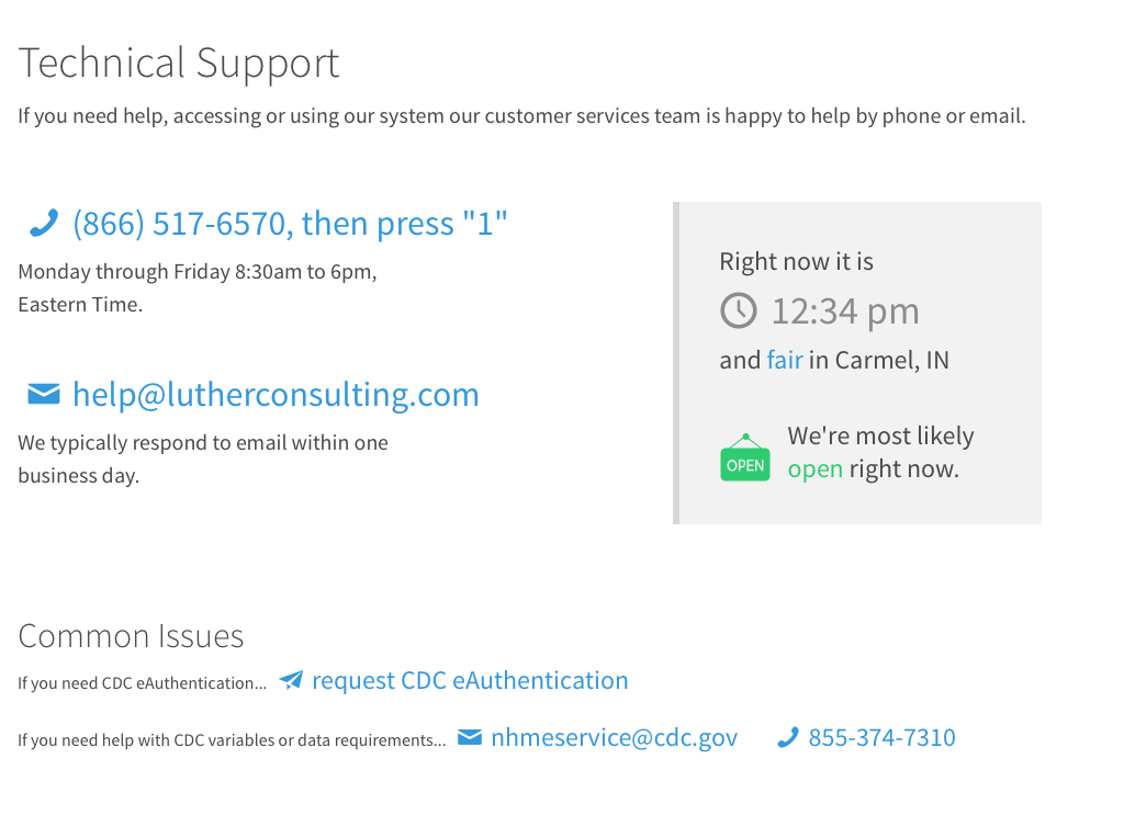
Though the technical support email and phone number were prominently displayed across company resources and trainings, there were some gaps in information on how to contact technical support. For instance, hours for phone support were missing. Going a step further, I added time detection JavaScript to cue whether it was likely the company was open. This is important for a company that is confusingly positioned in Eastern Time but services customers nationwide. This little client-side script proved an interesting challenge. I used Moment.js to detect the time and Moment Timezone to detect the user agent time. Then the script had to detect the day and convert the time into Eastern time. The UI copy is somewhat of a hedge by saying "We're likely open right now". There's no good way to detect holidays. However, the copy does make a point to say that technical support is open on Federal holidays, an important consideration when working with government employees.
Finally, I added some frequent issues and key partner contact information to provide an additional reference for information technical support staff have to give out via email or on the phone regularly.
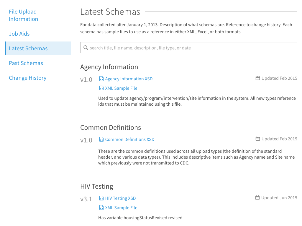
The final goal was to provide a cohesive experience across the resources. The before screenshots had resources split between two pages with very different formats. The redesign brought all of the resources into a predictable format. The upload information benefitted even more than training materials. As upload information is versioned, it became important to differentiate the current version from archived versions (that are still used by certain users). All of the sections have keyword filtering courtesy of list.js to make, particularly the history, easier to digest.