
Anyone who has been to a doctor, dentist, counselor, or other healthcare provider knows and has been at least mildly annoyed by intake forms. The overwhelming, at times confusing, stack of paperwork that greets us at our first appointment. To the right are examples from a dentist and a counseling practice. Both came up in a Google image search. They are provided as typical examples, not to specifically pick on their user experience.
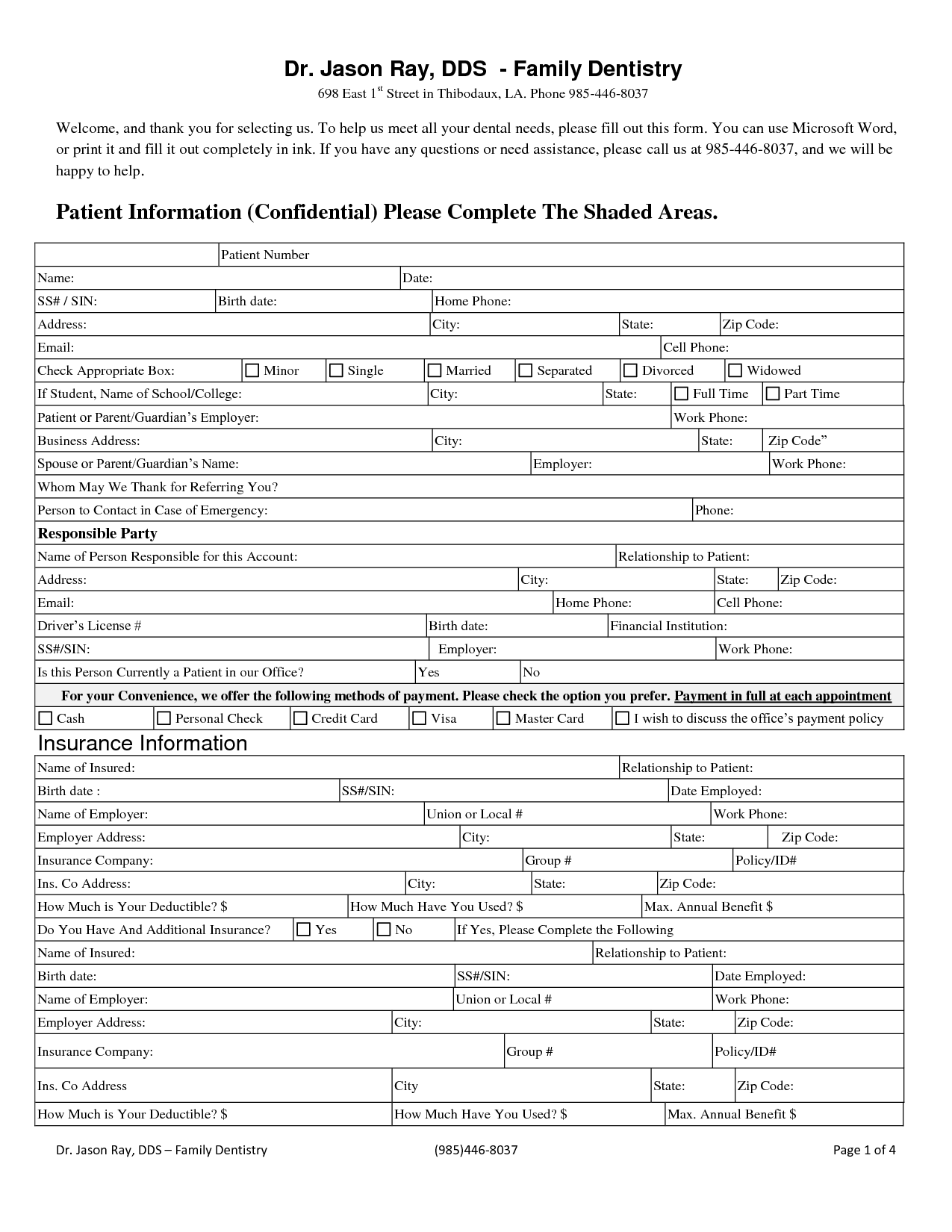
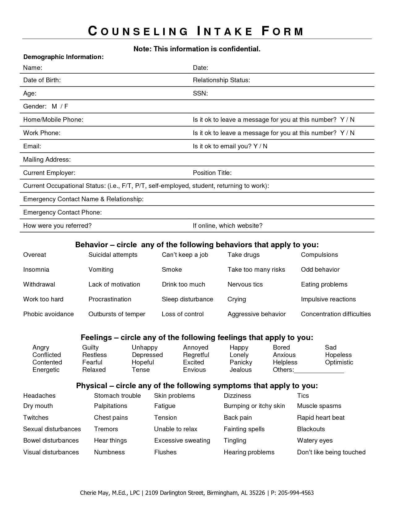
Typically, intake forms are handed to a patient on a clipboard to fill before the visit. An administrative assistant or other staff then key enters the handwritten form into whatever Electronic Medical Record or data system the office uses. The paper form is sometimes consulted by the nurse/doctor/counselor during the first visit, but is generally is filed for archival purposes after data entry.
Paper forms generally have poor user experience (poorly written instructions, unclear copy, inadequate space for answers) and they offer no real time validation. They necessitate additional labor of data entry for each new patient/client. Further, there's room for error in the data entry person's interpretation of hasty hand written responses. Simply digitizing existing forms would allow validation and obviate data entry, but would many of the usability issues would carry over. Design constraints of paper forms (physical space, legibility, human handwriting) just don't apply on a screen (no matter how much we try to replicate it).
This interface concept seeks to move intake forms from an error-prone, time consuming task to a more conversational, friendly experience that can augment service and care. Click any image for a larger view of the mockup.
Beyond the clipboard
In place of the traditional clipboard, intake can be completed on a provided tablet (iPad in Guided Access mode would be great here). Alternately, the patient/client can be sent a single serve link to their smart phone and do the paperwork either at home or in the waiting room. A tablet or smart phone provides a great opportunity for an optimized touch interface. Rather than having to write/type every entry, there are a lot of opportunities for easy to tap buttons tailored for the question at hand.
Rather than using the paper form as a metaphor, this concept takes the clinical interview as the metaphor. The interview begins with basic information to build rapport before building on previous responses to solicit more sensitive information (e.g., medical history, drug use, mental health issues, sexual behavior). As with a conversation, there's a flow from question to question. In this case, questions are generally answered one at a time.
Adopting a conversational style can help the client understand the questions better and provide more complete/truthful answers. Contrasted with more stilted terms like "Responsible Party" or "Current Occupational Status". The copy on screen should be targeted at an eighth grade reading level to be accessible to a range of clients/patients (this is the guideline for broadly accessible surveys). The tone strives to replicate the friendly, though professional, tone of a good clinician.
The guided nature allows the application to only present relevant information to speed completion. For instance, if the patient says he is male, then it can skip all pregnancy related questions. Similarly, information about parent/guardian would only be presented, if the client/patient is younger than 18.
This touch frontend would need to sync with the data system or EMR of choice (easier said than done, though EMR interoperability is slowly becoming a reality). This is critical to remove the additional time and chance for error from manual key entry.
Finally, the data can automatically be formatted for PDF or print at the end. This will build trust with office workers and service providers that are comfortable with paper forms. Further, regulations around archiving can be satisfied without additional staff time. The formatted version can surpass the standard paper-only version by organizing and highlighting information contextually. For example, a family history of heart disease and high cholesterol can be displayed more prominently than just circles on a list.
Guide the conversation
The intake conversation begins with basics like age and gender. The system should already know the patient/client's name from the office scheduling the appointment and initiating the intake process. Already, one less piece of information to enter.


For gender, the application can be more inclusive (gender rather than sex, inclusion of transgender) than the typical paper form and icons help make the more complex concept of gender (as opposed to biological sex) more accessible to a broad audience.
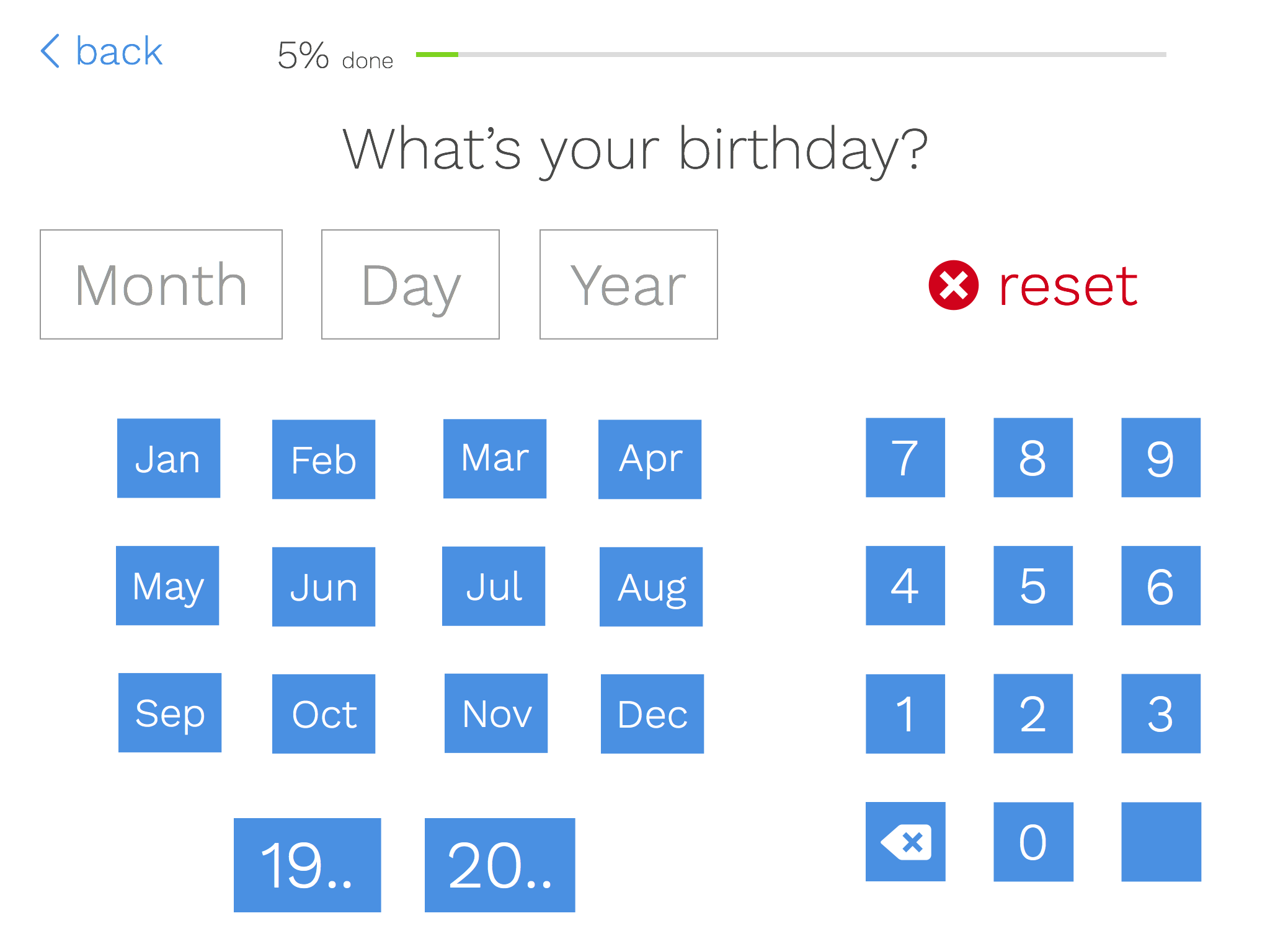
Date of birth should be positioned near the beginning of the process because it can be used to inform future questions. For instance, if the age is under 18, the system can prompt questions about parent or guardian. Various age-based milestones can be built into the question logic as well. For instance, patients near 50 can be asked about colonoscopy or teen clients for a counselor can be asked age specific mental health risk screening questions (e.g., around bullying). Age does not need to be entered separately as it can be easily calculated from date of birth, removing another redundant field from standard forms.
Datepickers are often awkward on touch devices. After years of using spinners on iOS, I still haven't really gotten the hang of them. Though I would not advocate replacing native UI components in all cases, this is a case where the data entry is straight forward and can be expedited with custom input buttons. Each month is easy to tap. The day and year can be quickly tapped out with the 10 key pad on screen (this could be replaced by the native number keypad on phone, which is absent on iPad). "19.." and "20.." provide a shortcut for entering year of birth.
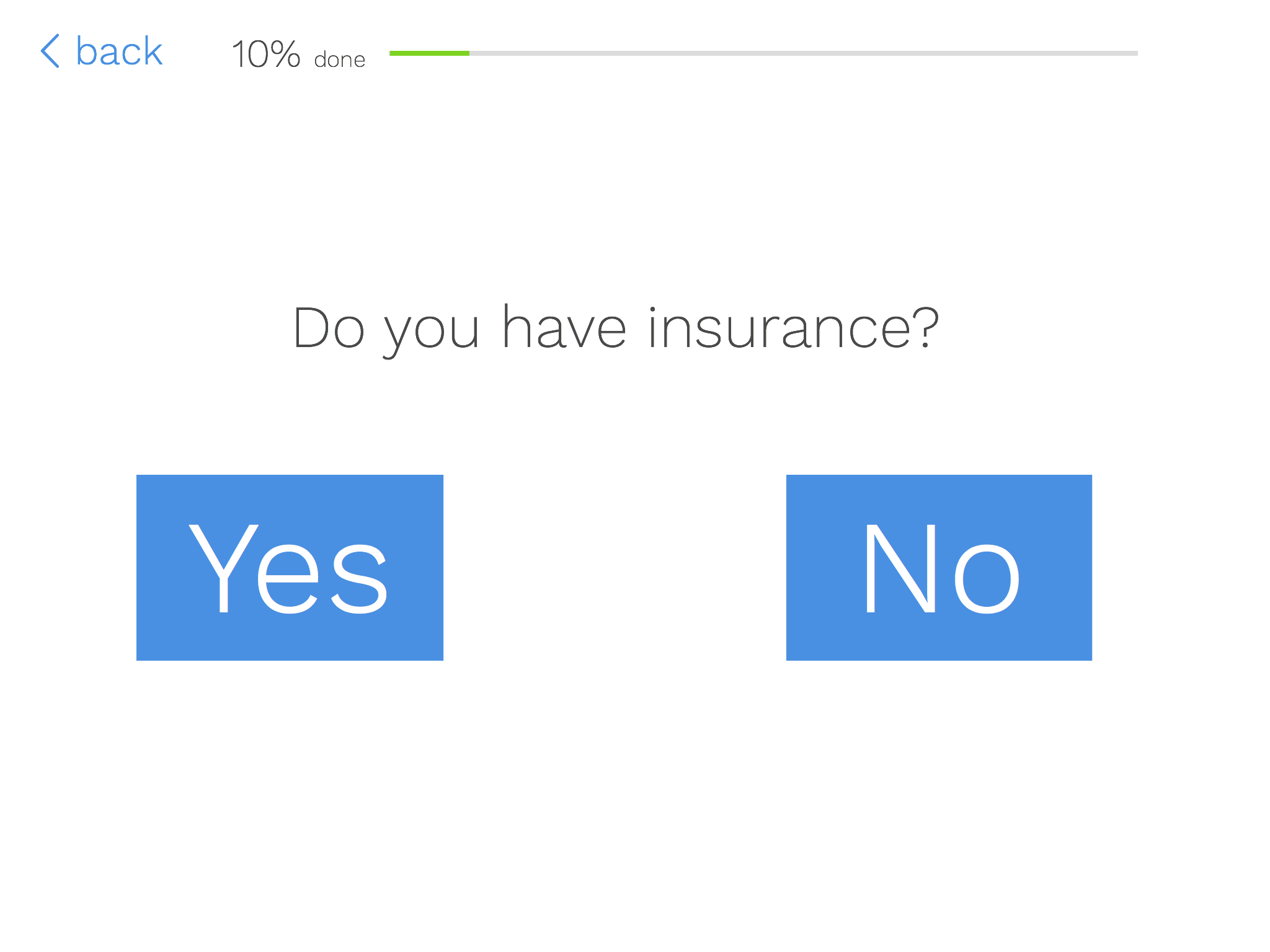
For healthcare providers in the US, patient/client insurance is a key piece of information. The options are big, easy to tap buttons, rather than a checkbox or radio button (which are much too small a touch target, no matter which guidelines you follow).
Insurance can be used for branching as well. Those with insurance can be directed to insurance information. Those without can be directed to payment information. Tools available in consumer apps (particularly those for payment processing) can be leveraged for entering insurance information more easily and accurately. First, patients could select from a list of approved insurers for the provider (whether a provider accepts a patient's insurance is a common point of confusion). Group number and ID numbers could be validated for length and format for the selected insurer; much as a Visa card is validated form proper format, not necessarily the correct number. The device camera could scan the insurance card as many apps read credit cards currently. Use of the camera would obviate data entry and requisite office photocopies.
Collect sensitive information
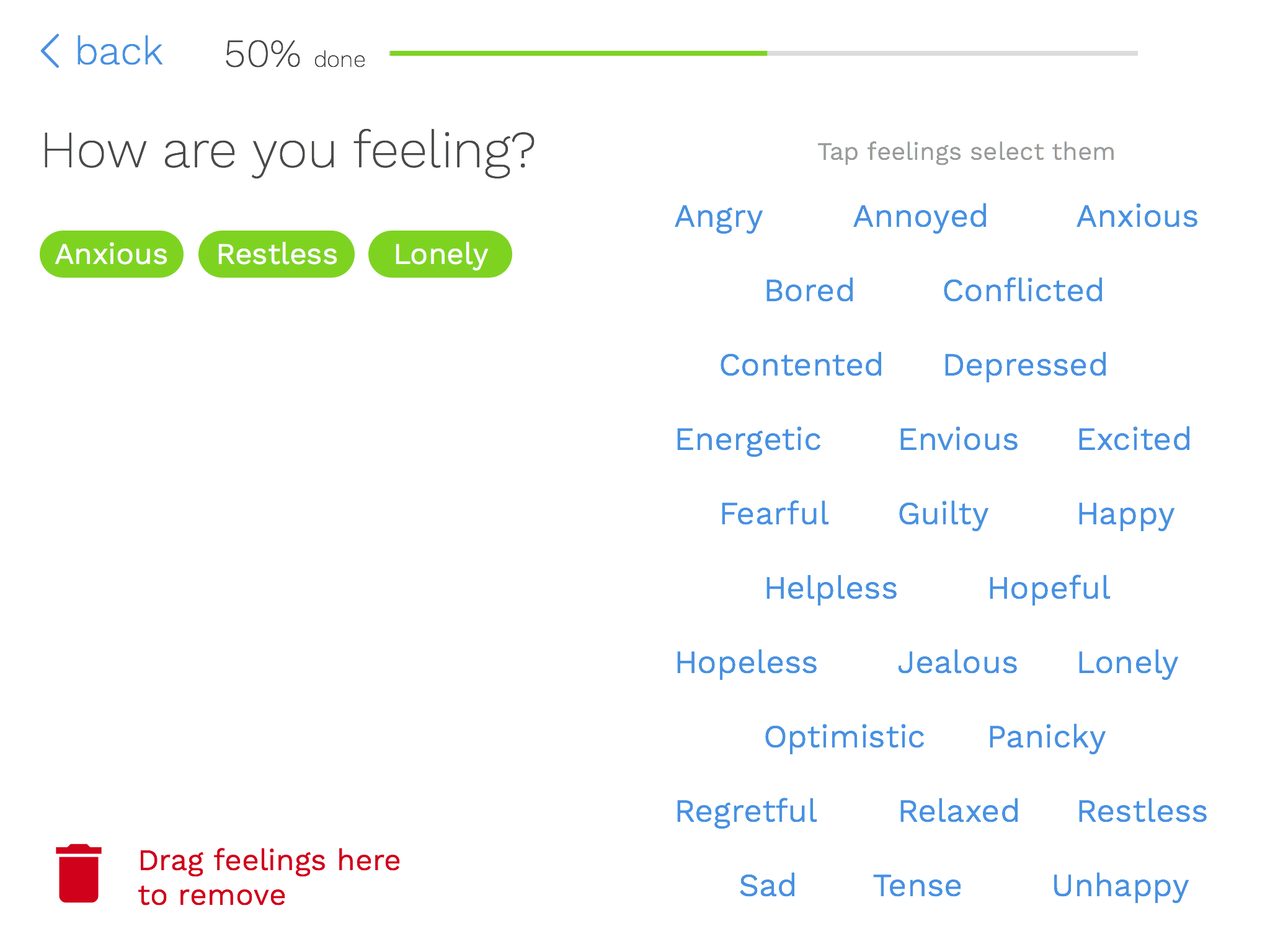
A richer intake experience can help solicit information from counseling or social service clients that would be difficult for a paper form. Borrowing cues from tagging interfaces, clients can tap their recent feelings or behaviors. A similar method can be applied to mental health related behaviors, medical history, or (sexual or drug-related) risk behaviors. There are possibilities for ranking of symptoms or search/filter lists for long lists of symptoms, conditions, or prescription drugs. A patient could search for a drug allergy and avoid misspellings (I still have to look up the spelling of erythromycin after that bad experience as child). Patients on a larger number of prescription drugs could have the space they need to add all of their medications, rather being limited to space on a page.
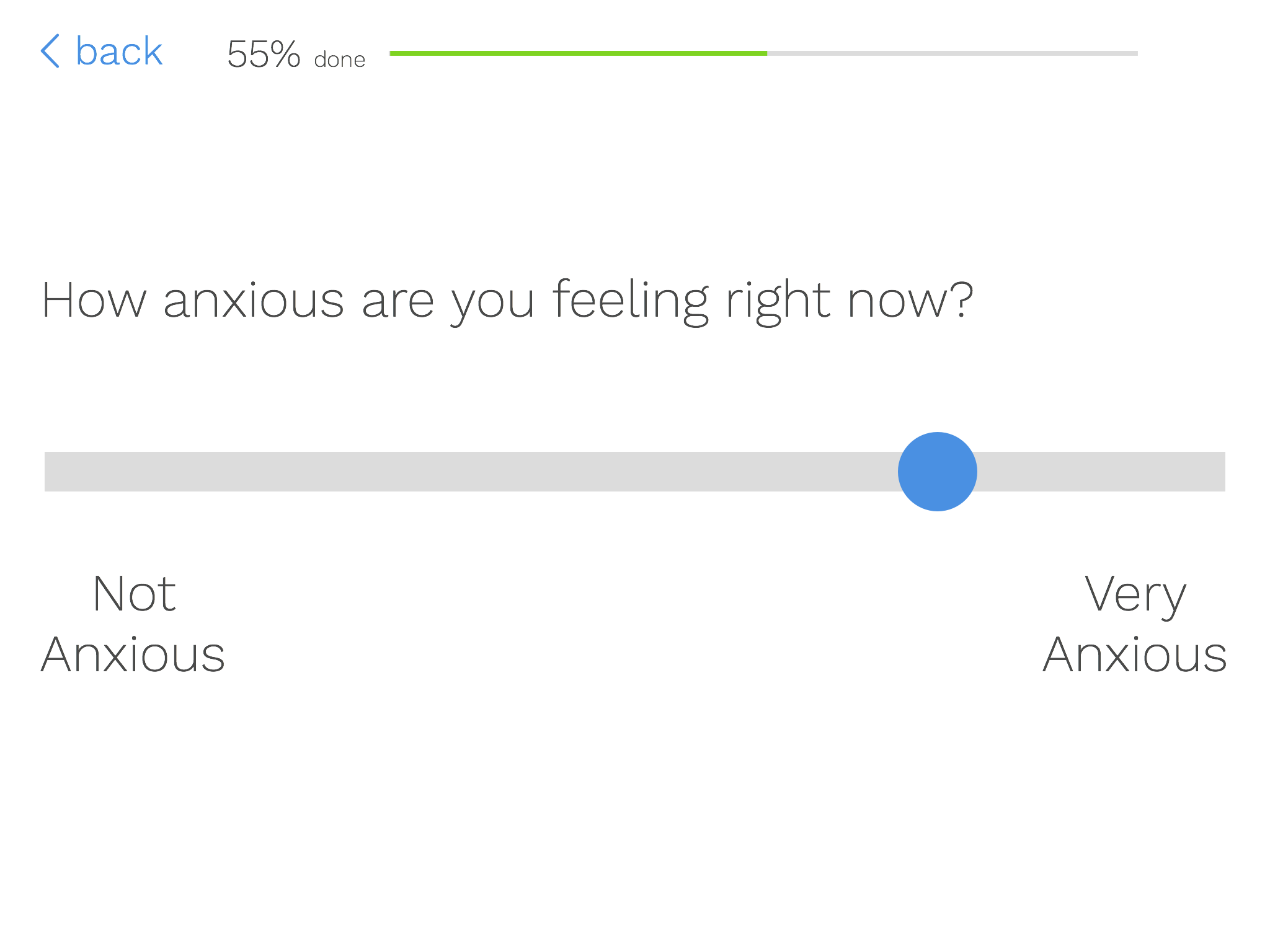
Based on the selected items on the previous screen, the patient can be contextually delivered follow-up questions. In a mental health context, this could be severity ratings of feelings or symptoms (as a fine-grained Likert scale potentially). For current prescriptions, it could be information on dosage and length taking the drug. For family medical history questions, it could ask specifics of which relatives had heart disease or high cholesterol.
Collecting all of this rich data has the potential enhance service. The counselor or doctor can readily have access to a summary of the client/patient's answers. The report can prioritize particular feelings or behaviors (e.g., suicidal ideation) or highlight high-risk combinations of responses (e.g., depression and drug use) to aid in clinical decision making. Having a clearer idea of what the patient/client reported can help build rapport during the first interaction.
Taking it a step farther
An article on implementing Slack for Healthcare helped crystalize my thinking on this interaction concept. If the metaphor for this interaction is a clinical interview, why not making it more like conversation? Rather than static screens, a Slack Bot-like AI would ask and respond to questions for the intake process. Where appropriate the patient/client could type responses or the UI could contextually serve up appropriate response buttons (Yes/No buttons or Male/Female/Transgender buttons) for one tap responses.
A challenge with this method is that would be more difficult to collect health history or mental health risk behaviors. Also, it would be difficult to show progress toward completion. Paper is finite, so there's always a cue as to how close the patient is to completion. Progress indicators can mitigate this for the above concept. The patient could see a countdown of remaining items to answer as a way of cueing progress toward their goal.
Finally, both the above concept and a hypothetical messaging-based version would need to clearly show a final version of the patient's information for review before finalizing. By answering each piece of information in turn, it could be easy to lose the forest for the trees. A clearly formatted version of the patient's response would offer good feedback on their work. The patient would also need the ability to quickly edit any information from this final view.
All mockups were created in Sketch. Icons are from icomoon.io.