When I joined JumpCloud in 2019, the engineering team was rapidly expanding. With many new engineers working at a fast pace, the interface started to become inconsistent. New features were implemented with a combination of older versions of the brand, design directions that had been abandoned, and one-off ideas developed in isolation without consideration for extensibility. In fall 2019, I led a hackathon project with a team of engineers and designers to create a proof of concept design system leveraging Storybook. After the hackathon concluded, both UX and engineering identified that building out the design system could prove useful, so I took on design system work and Storybook integration as a 10% project. After 4 months, the project was successful enough that I was put on the project full time. Leadership recognized the value of the design system and I was given additional engineering resources. My team grew to 3 engineers and a QA engineer with me as technical lead.
Now that the library is more fully integrated into the platform, we're experiencing increased demand for components. Though I wrote most of the foundational components for the library, my role has shifted. I am still actively contributing components, but with a new focus on documentation and providing strategic guidance to a growing number of UI engineers on feature teams. This includes bolstering documentation, working with designers on choosing patterns for new features, conducting training sessions, pair programming with engineers, and building subject matter experts throughout the engineering organization.
Libraries
The component library piece of the Stratus Design System is a private npm library built in Vue.js to support the web applications in JumpCloud's platform. A common color library serves as the source of truth for the UI color palette for a variety of development platforms: SCSS, custom properties, and JSON. The color logic and export file generation is written in Node.js.
The component library Storybook documentation is publicly available at design.jumpcloud.io.
Integrations
My team has integrated the component library into three applications to date. The UIs of two were entirely refreshed to use the new components to improve the UX, responsiveness, and accessibility. The third application, the administrator portal, was too large and complex to be refreshed quickly, and would require a solution that supported a mix of new and legacy UI.
Refreshing the administrator portal was going to be a tremendous undertaking for product and engineering, and was blocked by a big piece of technical debt that made mixing legacy and new components impossible. The legacy application had a custom pixel font-size set on the html, while the new UI components were built with rem units assuming browser default. This caused new UI components to rendered incorrectly when used on legacy pages.
The component library heavily leverages CSS custom properties, so I architected a solution to abstract all sizing into custom properties. For example, rather than setting padding in a component to 1.5rem, I set it to var(--size-1p5). The custom property is set to 1.5rem by default and then 24px when a legacy class is added to the html element in the application. For example, this allows the components to be used on a page where the rem is set to 14px. This change required refactoring all of the component sizing, necessitating an extensive regression test effort that involved both the design team and my team's QA engineer. The effort was justified as it enabled new UI components to be used in any part of the application. This has allowed broader adoption of the design system in the administrator portal.
Components & Documentation
New UI components are built with composability and flexibility in mind. Semantic color names and meta variables like --jc-border or --jc-input-padding are combined into tokens to ensure ease of use for contributors and maintain consistency. Many components leverage Vue slots, so custom implementations are possible. For example, a confirmation modal can have a custom footer instead of the default button group. This flexibility supports variations without requiring a separate component for each use case. By using these style tokens and Vue slots, developers can even compose one off UI elements within other applications that are aligned with the look and feel of the new UI components.
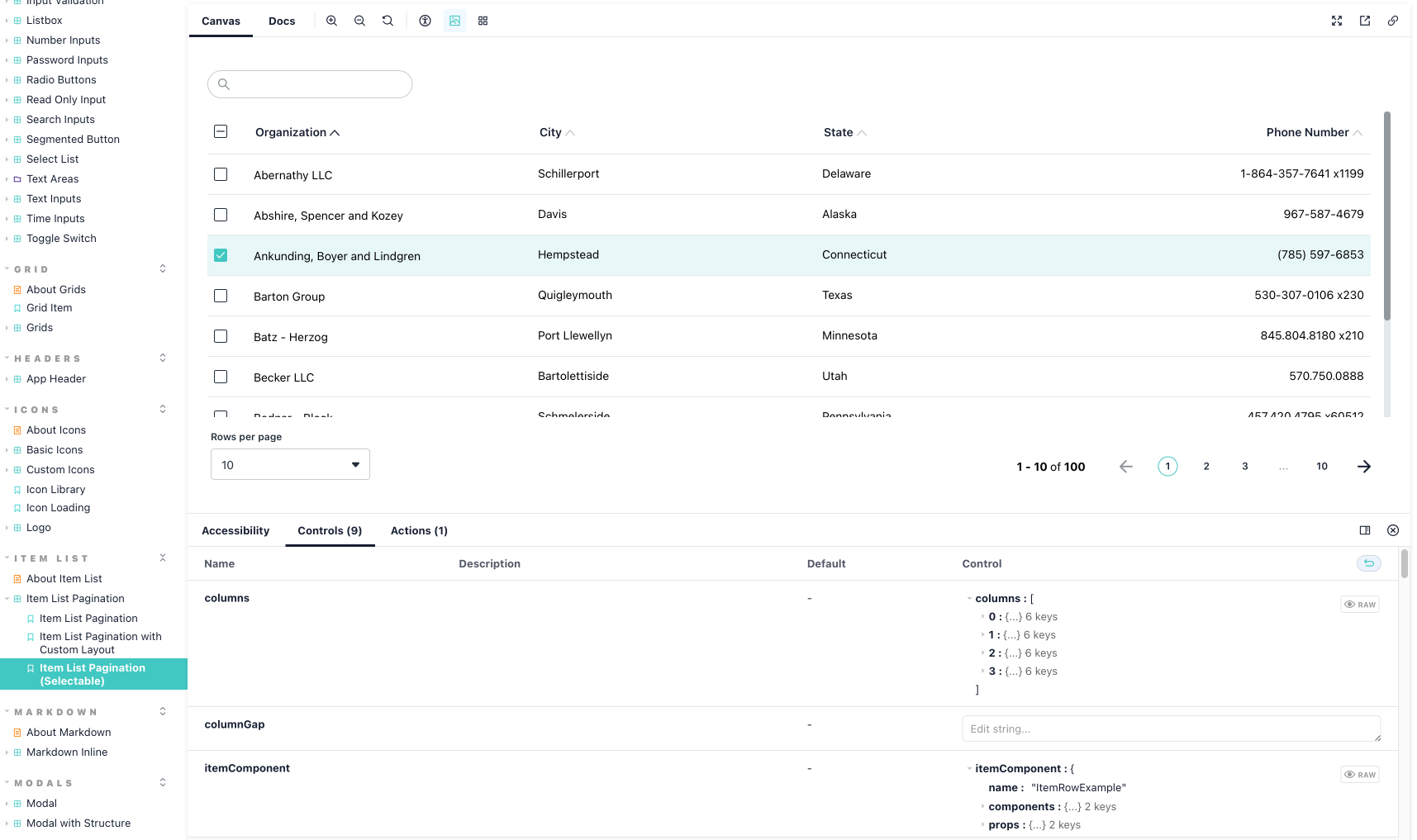
This approach is used within the library to build complex components like ItemListPagination, which is built using the atomic design framework. At its lowest level, it uses style tokens like colors, borders, and spacing. It also leverages atoms like checkboxes, icon buttons, and select list. Finally, it uses molecules like the pagination bar and an optional toolbar that can be added via a Vue slot. Each list renders a row component unique to the list that is linked to the header via configurable grid layout. All of the methods for sorting and pagination are emitted events. Ultimately the component is presentational, only rendering what its parent business logic and data controls, allowing the component to be independent of a particular data model or implementation.

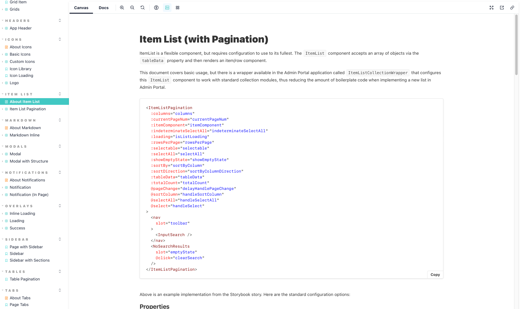
For components that require extensive configuration like Tabs or ItemListPagination, I wrote documentation pages with code samples. To make these components even easier to use, I wrote wrapper components in administrator portal to reduce boilerplate code.

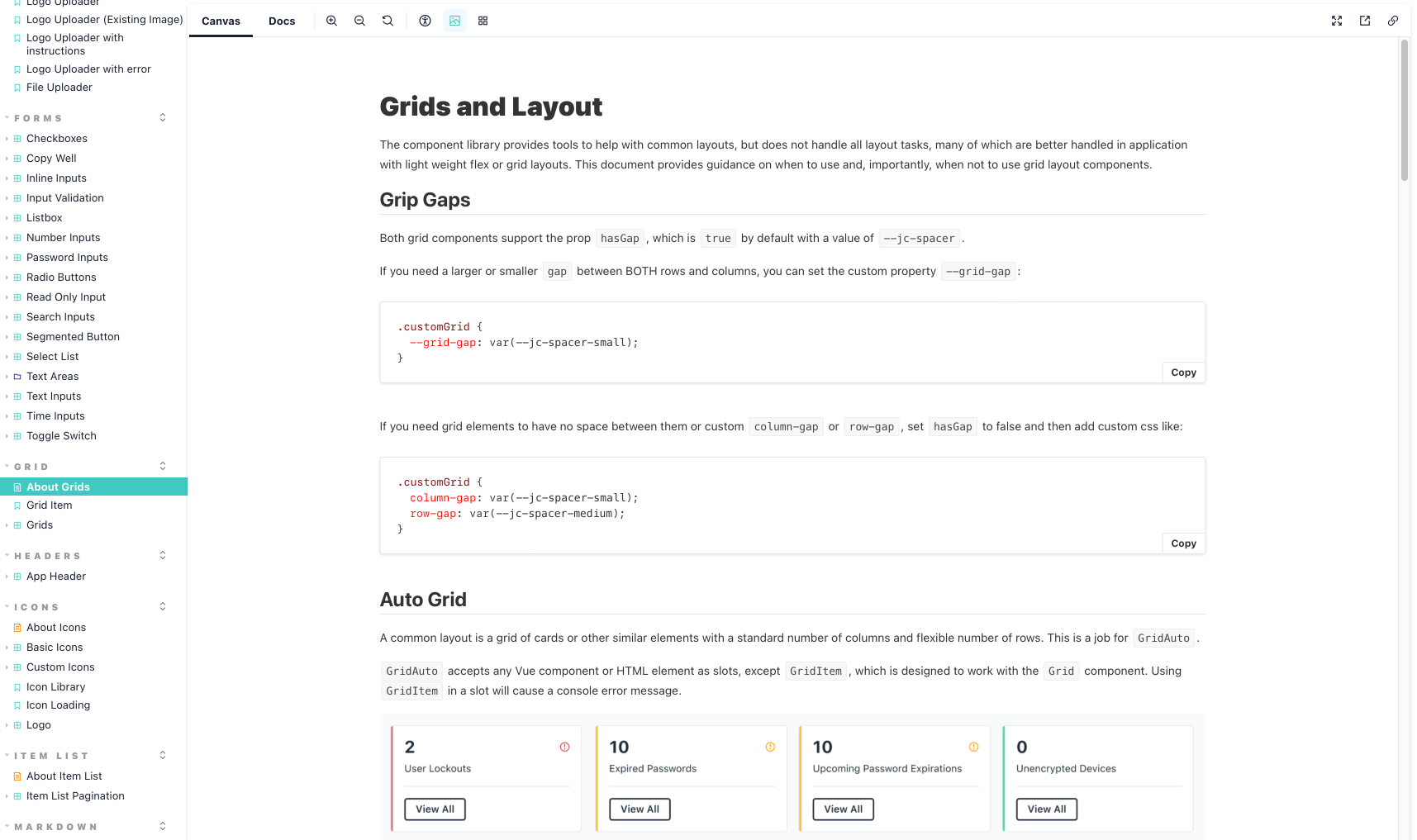
The documentation has evolved as teams use the system in feature work, revealing gaps or points of confusion. For instance, observing usage of use Grid components, I wrote documentation on how, when, and, importantly, when not to use the Grid components. I used real life examples of designs and provided suggestions on how to implement them using the library.

Testing
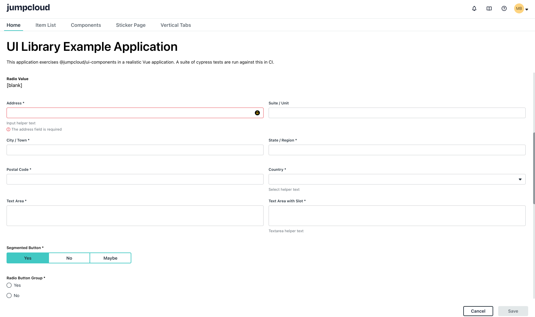
To ensure quality, new UI components are covered by unit tests written in Jest and manually tested in Storybook. Storybook is great for exercising and previewing components, but the implementation is somewhat artificial, particularly for form elements. To more thoroughly cover the component library, I configured an example Vue application with a suite of functional tests written in Cypress. It lives in the repository, but imports the library like other consuming applications. A Cypress test suite runs in CI to catch issues in important interactive components when new changes are introduced. For instance, there is an end-to-end test of form behavior. To test data binding for all form element types it prints values on the page, checks that validation behaves as expected, and verifies that a success notification is dispatched on save. This protects against regressions when refactoring or updating existing components.

