
A bit of context
We are working on a HTML refresh of our applications. Our CSS is completely em based (see here for a discussion of the advantages). Our default font is Adobe's Source Sans Pro. It's reasonably attractive, open source, and readable at a variety of sizes. At the time I started using it, it was only available in OTF and TTF via Adobe's Source Forge. They have since added a full web font stack (i.e., EOT, WOFF). I used Font Squirrel's converter rather than dealing with converting to EOT, WOFF, and SVG manually. Font Squirrel was allowed to host and generate @font-face CSS for Source Sans at the time, but no longer.
I installed the Source Sans Pro TTF on my machine from Adobe's official repo. I happily wrote a bunch of CSS based on this version of the font, including some apparently fragile heights in my navigation bar:

My layouts were a bit suspect after an Internet Explorer debacle involving the worst Internet Option in existence, but I remained blissfully ignorant until this week.
An inch is not an inch
After some reorganization of my development files, I noticed that line spacing on our sites was off. It looked like the oddities of Segoe UI, I had ignored in the past. Troubleshooting revealed that the @font-face files were not downloading due to a broken path variable in the SASS files. However, Source Sans Pro was still loading locally. A bit of head scratching and a moment of insight got me thinking that maybe the Font Squirrel version and Adobe version installed locally were different. I set up a test of this hypothesis...
I created two copies of my Source Sans @font-face partial. One used the same Font Squirrel generated files as I had, but I changed the font family to "Source Sans Pro Font Squirrel". I made a copy of the @font-face file, but pointed to a new directory called SourceSansProAdobe. I dumped all of the EOT, TTF, WOFF, and SVG files from Source Forge in there. I called that font family "Source Sans Pro Adobe". I created a new CSS file with only our reset partial included and the two new @font-face partials. This is an example of the light weight:
@font-face {
  font-family: "Source Sans Pro Font Squirrel"
  src: url("{$location}/SourceSansPro-Light-webfont.eot");
    src: url("{$location}/SourceSansPro-Light-webfont.eot?#iefix") format("embedded-opentype"),
  url("{$location}/SourceSansPro-Light-webfont.woff") format("woff"),
         url("{$location}/SourceSansPro-Light-webfont.ttf") format("truetype"),
  url("{\$location}/SourceSansPro-Light-webfont.svg#SourceSansProLight") format("svg");
  font-weight: lighter;
  font-weight: 300;
  font-style: normal;
}
I color coded each of the different fonts with background color to see what was going on. The container div background was set to grey to show vertical alignment better.
What did I get? All kinds of weird. The Font Squirrel and Adobe version are very different in height and spacing around the glyphs. For the sake of argument, I decided to include Source Sans Pro from TypeKit. We didn't really have a compelling reason to use TypeKit because of the limited number of fonts we used that are just as easy to self-host and avoid the cost of additional javascript. Surely, TypeKit would appear the same as one of the others. Nope. It plays by its own rules as well.
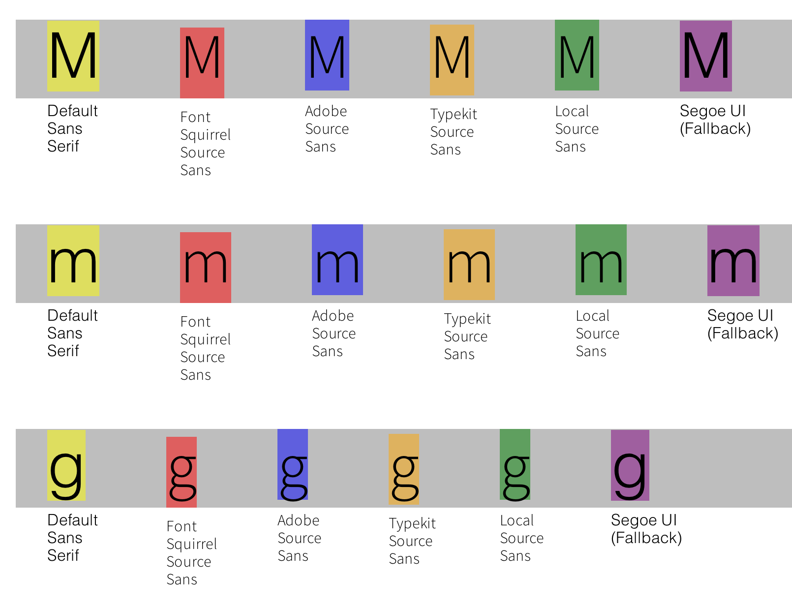
I then hopped over to my VM with IE9 for testing, so I could see what happens with Segoe UI in the mix.
Honestly, none of the fonts in the mix behave the same when it comes to vertical spacing and alignment. What a mess!
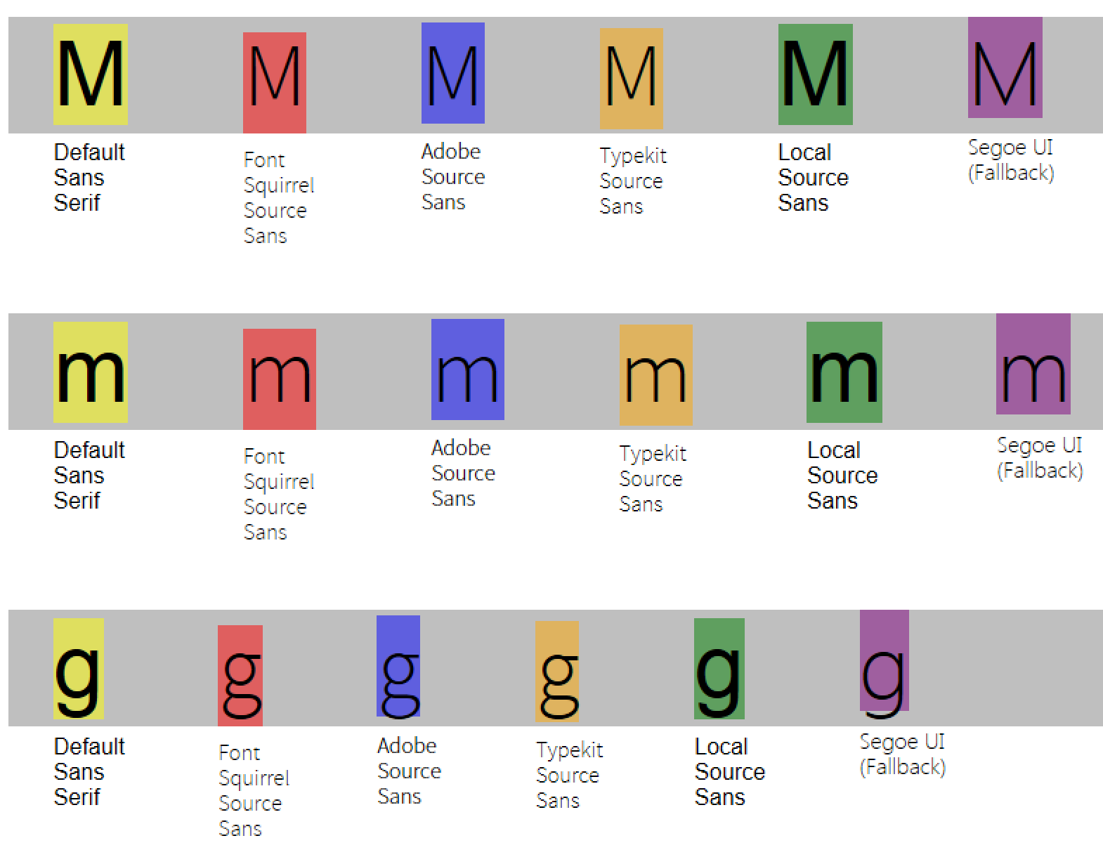
The reset we're using has most tags set to vertical-align: baseline, which is standard practice. Setting that property to vertical-align: bottom resolved some of the height issues, but we have g and p extending beyond the container. Not ideal, but it does solve some of our issues.
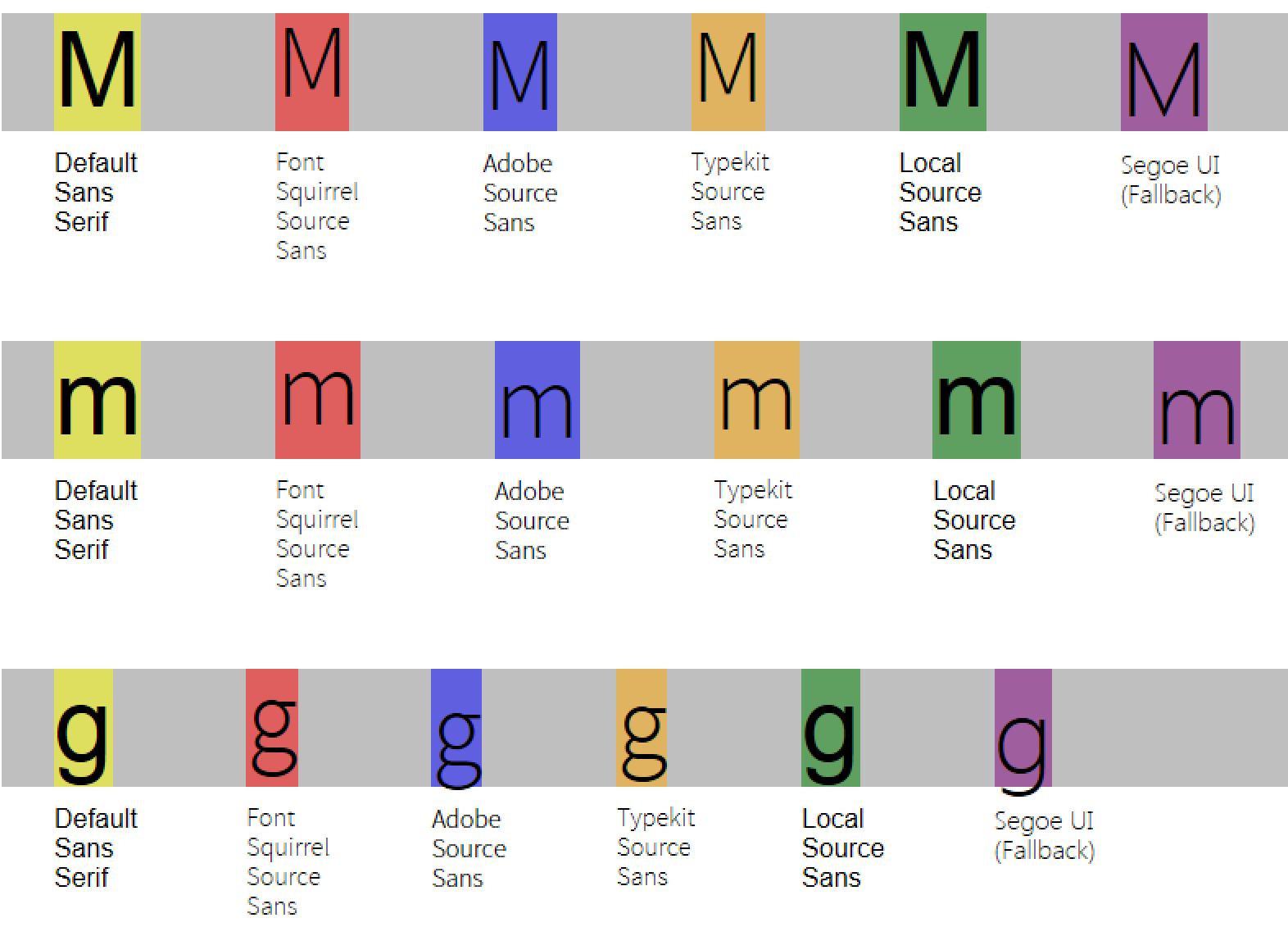
Ultimately, we decided to switch to the Adobe version as it has greater consistency in layout when it needs to fallback to Segoe UI. I was also able to greatly reduce the complexity in my @font-face declarations:
@font-face {
  font-family: "Source Sans Pro"
  src: url("{$location}/#{$fontName}-Light.otf.woff") format("woff"),
  url("{$location}/#{$fontName}-Light.otf") format("opentype");
  font-weight: lighter;
  font-weight: 300;
  font-style: normal;
}
All of the EOT was for legacy IE8 and lower support, so we can ditch that. SVG was only for old iOS devices, of which there will dwindlingly few by the time this is truly available for mobile devices. That left us with WOFF (for most browsers) and OTF (for some older stragglers, mainly of the Android tablet variety).
I'm on the fence about the vertical-align in the reset. There are arguments for both bottom and baseline. I'm also being more vigilant about writing fragile height declarations into my layouts now. Now remains the fun of going through all of the designs that rely on this CSS to see what is broken. Thus far, thankfully, not a lot.
In the end, I don't really know why the same font distributed by three sources (including two from the same company and two from the same source file) would have different heights. Or why system fonts have heights defined differently than web fonts. Can't we all just agree on an inch being and inch? Or centimeters at least? Any typography experts want to weigh in? I will post any responses as an update.