
When I used Tailwind on a project, there are vertical space utility (space-y-4 or divide-y) class that made ensuring vertical rhythm and dividers pretty easy. It had one big problem, you needed to add top padding to the children in the layout. Not hard, but it had a big gotcha: conditional rendering. If you have a column of sections to space or divide where all the sections are conditionally rendered, you have to add that business logic for the top padding for section suddenly becomes the first section in the group.
When I moved to a project that didn't have Tailwind, I searched for an easier approach.
I experimented with flex and grid layout, but came to the following snippet. This is simplified and converted to pure CSS. The production code uses styled-components to fit into the app conventions for styling. The principles are similar, though:
.vertical-space > :not(:last-child) {
  /* Sets the gap for the individual child */
  --gap: var(--component-gap);

  margin-block-end: var(--gap);
}
To start with a basic vertical spacing, I simply add a margin-block-end to each direct child, unless it's last. Pretty easy! But what about that custom property? This ensures one can nest these layouts with different gaps between children. I found pretty quickly that if I nested a --component-gap: 0.5rem inside a component-gap: 1rem, it wouldn't work correctly, unless the custom property was scoped to the children. This allows you to nest larger or smaller gaps without collisions. This allows a layouts like a form with input groups that all leverage this layout.
Why didn't I just use flex or grid and leverage the gap property? That would be a lot easier, for sure, but there are cases where you'd need add extra styling to children to make sure each child maintained full width. The goal here is to let the parent container do the lifting without the children needed to know what's going with their container. The custom property can be update via the React component for each usage if it needs to be different than the default.
Vertical Space with Divider
And now for adding a divider between children. Tailwind does this pretty well (though it requires a few too many classes without a wrapper component), but this is where it requires adding top padding, which can get tricky when something like a card/tile is a child.
/* Sets the default border */
:root {
  --border: var(--border-width) var(--border-style) var(--border-color);
}

.vertical-space-divider {
  --border-color: var(--component-border-color);
  --border-style: var(--component-border-styled);
  --border-width: var(--component-border-width);
}

.vertical-space-divider > :not(:last-child) {
  margin-block-end: calc(var(--gap) * 2);
  position: relative;
}

.vertical-space-divider > :not(:last-child)::after {
  border-block-end: var(--border);
  content: '';
  display: block;
  inset-block-end: calc(
    var(--gap) * -1 - var(--border-width)
  );
  inset-inline: 0;
  position: absolute;
  width: 100%;
  z-index: 1;
}
It's a similar idea to above, but adds the ::after pseudo-content to position the divider. No hr or conditional top border needed. The margin here is double the desired gap to obviate top padding. The inset for the divider uses some calc() to negatively offset based on the gap and border width, so it's centered between the children. The custom properties allow for component overrides of the styled pieces of the border, so a given use can change the color, style, or width as needed. In production, these are locked down via tokens, so the API is simpler and results in more consistent styling than the chaos of arbitrary values.
This also solidifies the choice not to use grid or flex since as of early 2025, we cannot style grid lines. Once that gets added to the spec and becomes well supported, it may well be a simpler alternative.
Caveat: the one down side to this approach I've found is falls down with children that have overflow: hidden. I discovered this laying out a column of accordion components. The workarounds are not hard, but a bit annoying. It's either wrapping components in a div or design components such that overflow:hidden is never on the outer most element. That seems a reasonable trade off for the ease of use in the vast majority of use cases.
In Use
The above is pure CSS that can be used as utility classes, but in our app this is all wrapped in VerticalSpace and VerticalSpaceDivider components. Here's what it might look like in use:
<VerticalSpaceDivider gap="space-lg">
  {isAdmin ?
    <VerticalSpaceDivider gap="space-sm">
      <Input>Input 3 (admin)</Input>
      <Input>Input 4 (admin)</Input>
    </VerticalSpaceDivider>
  : null }
  <VerticalSpaceDivider gap="space-sm">
    <Input>Input 1</Input>
    <Input>Input 2</Input>
  </VerticalSpaceDivider>
  <Button>Save</Button>
</VerticalSpaceDivider>
We have two input groups that have large space (e.g., 2rem) and then within each two inputs each with small spacing (e.g., 0.5rem) and then we have a save button. If the user is an admin, they will see both input groups with a divider, but non-admin users will see just a single input group. There is 32px of space between the two input groups and 16px between the inputs in each group. The save button is 32px from the last input group.
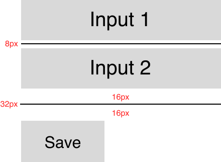 Default Layout
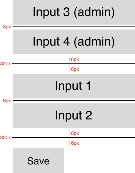 Admin Layout
The semantic design tokens accessed via React component props (e.g., gap, borderColor, etc) that are typed for consistency and to remove tyranny of choice and its attendant inconsistency. This was another downside of the Tailwind approach. It was hard to remember whether the border color was grey-100 or grey-200 for instance or if the spacing was v-space-4 or v-space-8. The simpler semantic tokens for color (light, base, dark) and t-shirt sizes space (sm, base, md, lg, etc) help the team more easily translate designs into code with less drift from page to page.